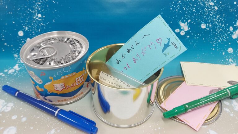
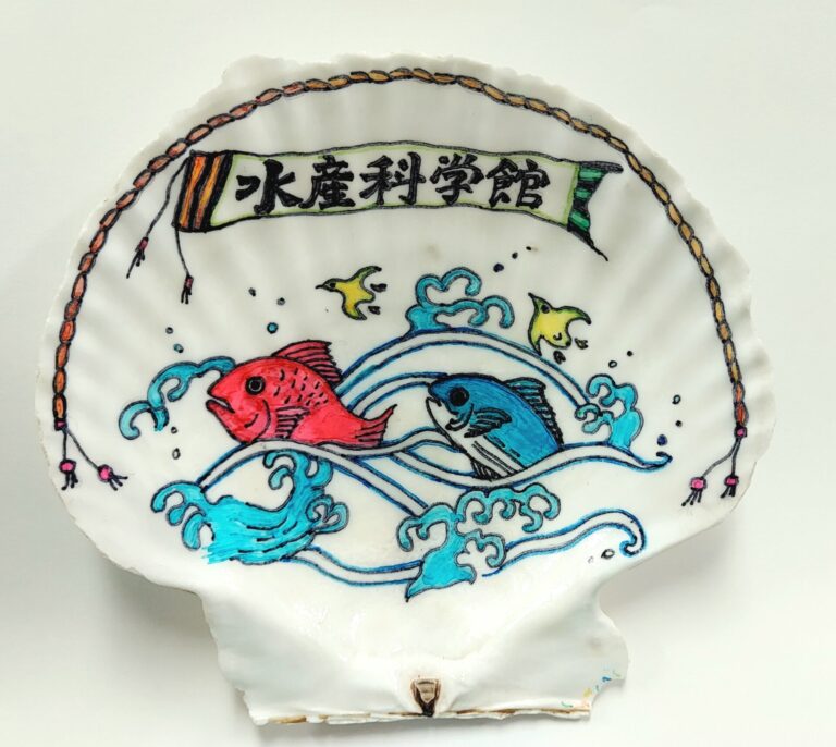
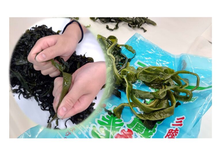
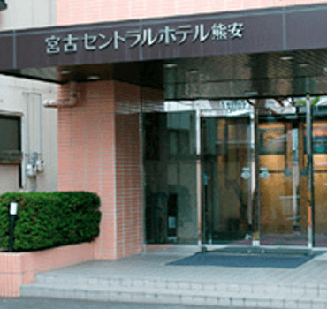
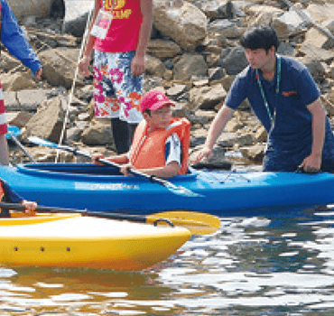
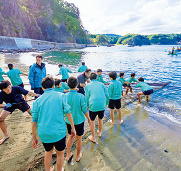
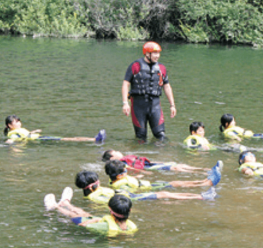
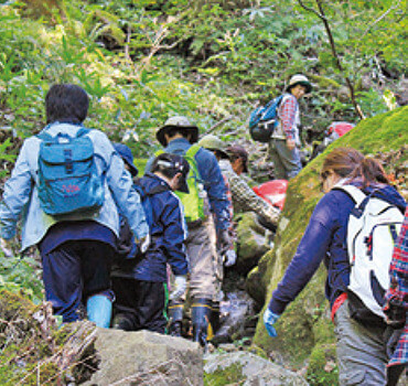
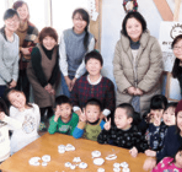
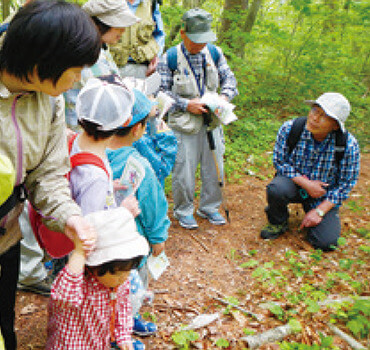
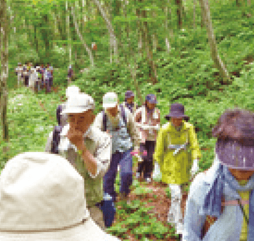
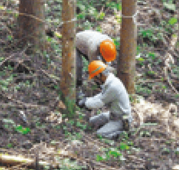
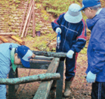
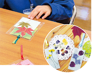
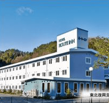
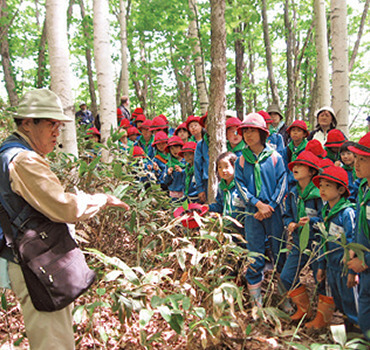
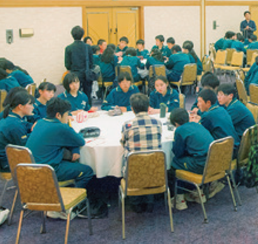
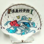
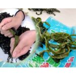
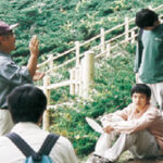
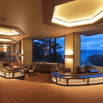
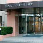
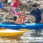
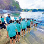
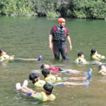
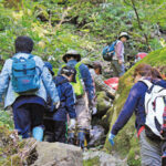
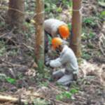
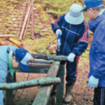
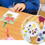
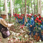
.layout-4790 .element_1587187627902 {
margin: 20px 0px;
border-color: #00A794;
border-width: 1px; }
.layout-4790 .element_1655808916629 {
overflow: hidden;
}
.layout-4790 .element_1655808916629 img {
max-width: 100%;
height: auto;
}
@media only screen and (min-width: 1024px) {
.layout-4790 .element_1655808916629 {
max-height: 250px;
}
}
@media only screen and (min-width: 768px) and (max-width: 1023px) {
.layout-4790 .element_1655808916629 {
max-height: 250px;
}
}
@media only screen and (min-width: 0px) and (max-width: 767px) {
.layout-4790 .element_1655808916629 {
max-height: 150px;
}
}
.layout-4790 .element_1587187895341 {
color: #00a794;
font-size: 18px;
font-family: noto serif jp;
margin: 10px 0px 5px;
text-align: left;
font-family: "Noto Serif JP", Sans-serif;
font-size: 16px;
font-weight: bold;
line-height: 1.2em; }
.layout-4790 .element_1587187895341 a {
color: #00a794;
font-size: 18px;
font-family: noto serif jp;
margin: 10px 0px 5px;
text-align: left;
font-family: "Noto Serif JP", Sans-serif;
font-size: 16px;
font-weight: bold;
line-height: 1.2em; }
.layout-4790 .element_1587187729822 {
color: #777777;
font-size: 14px;
margin: 5px 0px 20px;
text-align: left;
line-height: 1.5em; }
.layout-4790 .element_1587187729822 a {
color: #777777;
font-size: 14px;
}
.layout-4790 .element_1655776541101 {
color: #66CCCC !important;
;
font-size: 12px;
margin: -10px;
text-align: left;
}
.layout-4790 .element_1655776541101 a {
color: #66CCCC !important;
;
font-size: 12px !important;
;
}
.layout-4790 a{text-decoration:none}.layout-4790{vertical-align:top}.layout-4790 .layer-content{padding:10px}
#post-grid-4783 {
padding: 0px;
}
#post-grid-4783 .item {
padding: 0px;
background: #fff;
}
#post-grid-4783 .item .layer-media {
height:auto; }
@media only screen and (min-width: 0px) and (max-width: 767px) {
#post-grid-4783 .grid-items {
display: grid;
grid-template-columns: 1fr 1fr ;
column-gap: 5px;
row-gap: 5px;
}
#post-grid-4783 .item {
height:400px; }
}
@media only screen and (min-width: 768px) and (max-width: 1023px) {
#post-grid-4783 .grid-items {
display: grid;
grid-template-columns: 1fr 1fr ;
column-gap: 5px;
row-gap: 5px;
}
#post-grid-4783 .item {
height:400px; }
}
@media only screen and (min-width: 1024px) {
#post-grid-4783 .grid-items {
display: grid;
grid-template-columns: 1fr 1fr 1fr ;
column-gap: 5px;
row-gap: 5px;
}
#post-grid-4783 .item {
height:400px; }
}